This Touchscreen Car Interface is So Beautiful, You Don't Even Need to Look At It [VIDEO]
2014.02.20

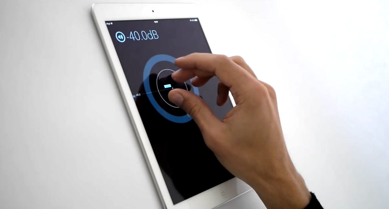
Designer Mattheus Krenn has figured out how to radically improve touchscreen displays in our cars and replacing all those ugly buttons with elegant options in this minimal multi touch UI. It's so beautiful, the driver doesn't even have to look at it.
Krenn's concept takes advantage of the modern touchscreen's ability to recognize multiple fingers at once. Two fingers on the screen will bring up a control directly under your fingertips. It will help adjust the volume. If you use three fingers, it will let you change the radio station. And even track selection too.
The system will learn a driver's habits, and just how many fingers they use to adjust a given setting. If you have an iPad, you can actually try out Krenn's concept. Check it out here: [Matthaeus Krenn via Wired]
More Articles
Copyright © Fooyoh.com All rights reserved.