How to Use Graphic Effects to Add Visual Interest: 5 Tips
Those who create content aim to captivate their audience and hold their attention for as long as possible. One way to achieve this is by incorporating graphic effects into their work. They add visual interest and make your projects stand out among competitors. Let's take a deep dive into how to use graphic effects to add visual interest and appeal to your work.
Add Depth and Dimension With Textures
Textures add an element of tactile feeling that makes your work come alive. They can create visual interest, especially if it’s carefully selected, and incorporated effectively. A great way to use textures is by using a high-resolution texture image as a background to your videos. This can add a unique feeling that enhances the overall look and feel of your work.
Another way to use textures is by picking the most suitable options at Studioplugins and applying them to specific elements in your projects. When adding such effects, you should be mindful of the overall impact it has on your work and ensure that it doesn’t make it look cluttered or messy.

Create Depth and Emotion With Lighting
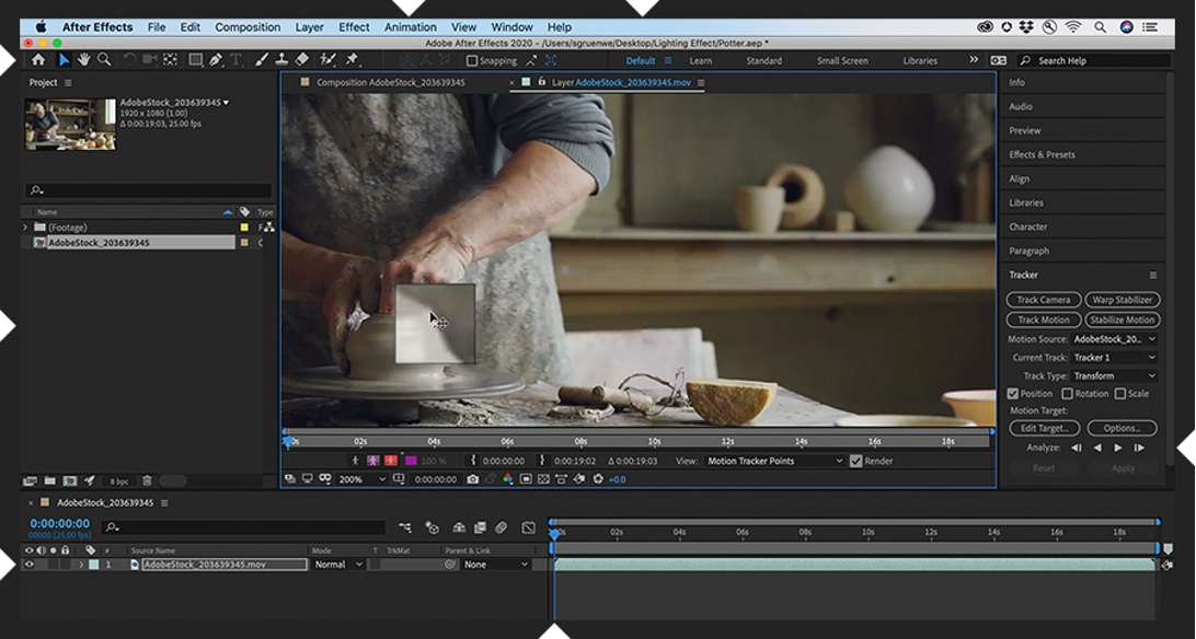
The proper lighting can make your projects look more lively and realistic. Its intensity, angle, and temperature can all influence the emotions conveyed by your content.
For example, if you’re designing an ad for a beauty product, soft, and warm lighting can make the product look more inviting and appealing. On the other hand, if you’re creating content for a rock band, high contrast, and cool-color temperature lighting can create an edgy and intense look that will grab the attention of your audience.
Add Flair and Interest With Gradients
Gradients are created by blending at least two colors to create a transition effect. Gradients can be applied to backgrounds, typefaces, and shapes to add depth and dimension to your content.
To use gradients effectively, ensure that the colors chosen blend well and enhance the overall mood of your design. For example, if you’re creating a video that promotes a healthy lifestyle, using shades of green and blue in your gradient will make it look refreshing and inviting.
Create Depth and Realism With Shadows
Applying shadows to elements can create a sense of movement or make an element pop from the background.
However, when using shadows, you should be mindful of the direction, intensity, and size of your shadows. A poorly placed or unrealistic-looking shadow can ruin the overall look of your project. For example, a shadow that’s too long or in the wrong direction can make everything look artificial and unprofessional.
Combine Graphic Elements to Create Interest
Layering allows you to create depth and dimension by placing elements on top of each other to create a sense of visual hierarchy.
When layering, you should balance the elements and ensure that they don’t look cluttered or overwhelming. Use a consistent visual style throughout your design to ensure that the layers complement each other.
After all, graphic effects can make all the difference between standing out and blending in. They let you create engaging content that captures attention and inspires action. With these tools, you now have the means to create stunning content that speaks volumes, builds loyalty, and drives your success.
More Articles