When Good Logos Go Bad: Vancouver Is Failing at Its Logo Redesign
2017.05.07
A while back, we took some famous brand logos and redesigned them using Comic Sans in place of their regular fonts. We wanted to see how logos would look if they used the world's most hated font. That said, it was just a joke—none of those companies are actually using Comic Sans.

But when it comes to logo redesigns, nothing is less funny than shelling out money for a new logo that totally tanks. Just ask city officials in Vancouver, Canada. After spending $8,000 to update their logo in March, they're already scrapping the design.
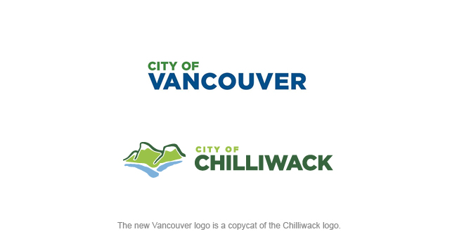
Mayor Gregor Robertson made the motion to ditch the new logo after two months of heavy criticism from designers and city residents alike. One designer in particular was upset about the incident: the man who created the City of Chilliwack logo. He pointed out to local media outlets that the Vancouver logo is strikingly similar to his design.
Vladimir Gendelman is a U.S.-based logo designer who agrees that the new design wasn't up to par. "The new Vancouver logo broke every redesign rule on the books," he said. "The worst thing you can do is to get rid of what's interesting about your design by trying to copy somebody else's work."
With Chilliwack right down the road from Vancouver—approximately an hour and a half away—it's plain to see where the Vancouver logo originated.
One thing the Vancouver design didn't mimic was the icon on the left side of Chilliwack's logo. The Chilliwack design features a mountain, while the new Vancouver design is all text. But Vancouver did include an icon at one point: a blossoming flower in the original logo. Residents complained that removing the flower erased what was most interesting about the logo in the first place.
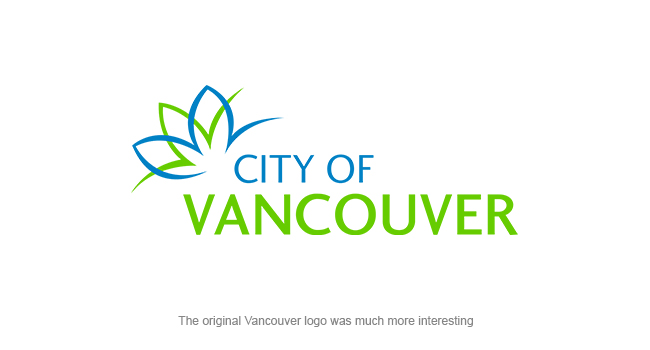
Another mistake Vancouver made: changing the logo's colors. Where the writing was originally bright blue and lime green, the new logo features much darker navy and forest green colors. Which would have been okay… except that bright colors are what gave the logo life.
"Dulling down the colors wasn't a good choice to make at this point," said Gendelman. "You want a logo that attracts attention to your brand. Dark colors are easy to overlook, and they play into the idea that the regionis cold and gloomy." Using brighter colors would have created a more vibrant and tourist-friendly logo for the city.
Even the new typeface adds to the logo's gloom-and-doom vibe. The Gotham font's fat, heavy letters don't have any sense of motion or energy—which can't be said of the city itself. Vancouver has a vibrant culture full of art, night life, and food, plus outdoorsy attractions that showcase the city's stunning natural beauty. The city's wide range of activities appeals to people of all ages and passions, which is why it's so disappointing the designer chose a font that appeals to no one at all.
The consensus in British Columbia is that it's a shame the city spent $8,000 for a logo they're not going to use—but a second redesign is definitely necessary. Vancouver's city council also agreed, voting heavily in favor of creating a new design in the fall of 2017. It's time for Vancouver to cut its losses and start fresh with a more creative, lovable design.

But when it comes to logo redesigns, nothing is less funny than shelling out money for a new logo that totally tanks. Just ask city officials in Vancouver, Canada. After spending $8,000 to update their logo in March, they're already scrapping the design.
Mayor Gregor Robertson made the motion to ditch the new logo after two months of heavy criticism from designers and city residents alike. One designer in particular was upset about the incident: the man who created the City of Chilliwack logo. He pointed out to local media outlets that the Vancouver logo is strikingly similar to his design.

Vladimir Gendelman is a U.S.-based logo designer who agrees that the new design wasn't up to par. "The new Vancouver logo broke every redesign rule on the books," he said. "The worst thing you can do is to get rid of what's interesting about your design by trying to copy somebody else's work."
With Chilliwack right down the road from Vancouver—approximately an hour and a half away—it's plain to see where the Vancouver logo originated.
One thing the Vancouver design didn't mimic was the icon on the left side of Chilliwack's logo. The Chilliwack design features a mountain, while the new Vancouver design is all text. But Vancouver did include an icon at one point: a blossoming flower in the original logo. Residents complained that removing the flower erased what was most interesting about the logo in the first place.

Another mistake Vancouver made: changing the logo's colors. Where the writing was originally bright blue and lime green, the new logo features much darker navy and forest green colors. Which would have been okay… except that bright colors are what gave the logo life.
"Dulling down the colors wasn't a good choice to make at this point," said Gendelman. "You want a logo that attracts attention to your brand. Dark colors are easy to overlook, and they play into the idea that the regionis cold and gloomy." Using brighter colors would have created a more vibrant and tourist-friendly logo for the city.
Even the new typeface adds to the logo's gloom-and-doom vibe. The Gotham font's fat, heavy letters don't have any sense of motion or energy—which can't be said of the city itself. Vancouver has a vibrant culture full of art, night life, and food, plus outdoorsy attractions that showcase the city's stunning natural beauty. The city's wide range of activities appeals to people of all ages and passions, which is why it's so disappointing the designer chose a font that appeals to no one at all.
The consensus in British Columbia is that it's a shame the city spent $8,000 for a logo they're not going to use—but a second redesign is definitely necessary. Vancouver's city council also agreed, voting heavily in favor of creating a new design in the fall of 2017. It's time for Vancouver to cut its losses and start fresh with a more creative, lovable design.
More Articles
Copyright © Fooyoh.com All rights reserved.