Here Are Some Data Visualizations That Make Absolutely No Sense
2013.09.03

It's always great to put numbers into some visuals, but what happens when they don't make sense? WTF Visualizations have been curating a collection of infographic excerpts that kind of explain next to nothing. They're beautiful no doubt, but it may just not mean that much to anyone who looks at it. Check out some of them below:
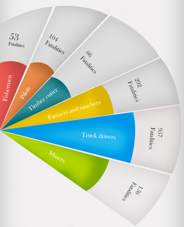
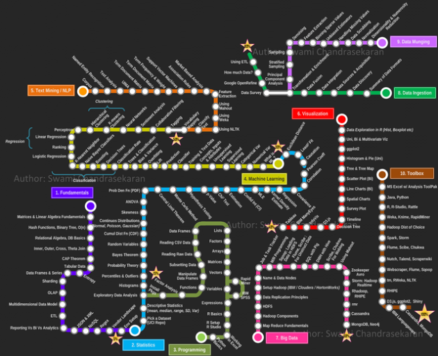
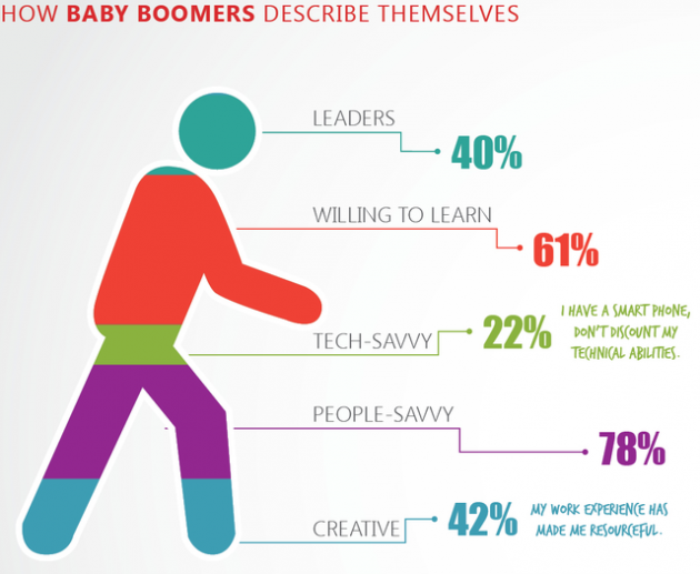


More over at: [WTF Visualizations via ]
More Articles
Copyright © Fooyoh.com All rights reserved.