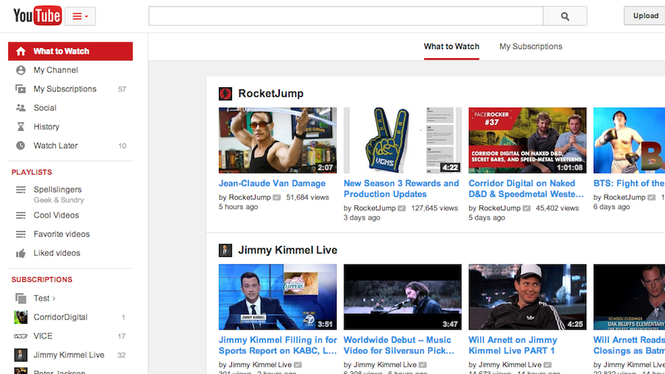
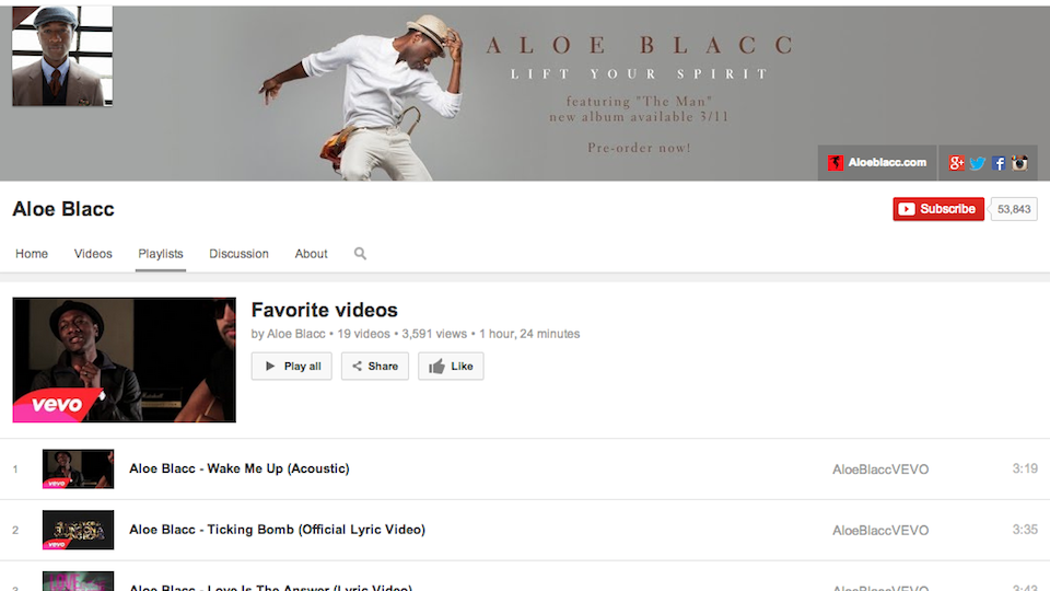
YouTube is Looking More of The Same on Mobile and on Your Browser
2014.02.21

YouTube is now looking the same on mobile and on your computer. The changes are pretty subtle at first, but the first thing you may notice is that everything is shifting over to be center-aligned.
YouTube is also placing a heavier emphasis on playlists. There's going to be an improved playlist editor page which should make tweaking the lists you've made easier too.

What do you think of the redesign?
More Articles
Copyright © Fooyoh.com All rights reserved.