Facebook Didn't Use a Fancy Redesign Because of Your Computer
2014.03.31

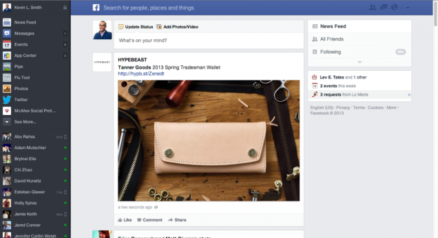
Facebook debuted a nice redesign featuring big, beautiful pictures last year. But they never rolled it out. The reason for it? Because most people have lousy old computers.
Entrepreneur Dustin Curtis had claimed that the reason for the redesign abandonment was because it didn't drive enough advertising dollars. Facebook's product designer Julie Zhuo says he's wrong and explains in a Medium post that it is really because of your archaic monitor.
It turns out, while I (and maybe you as well) have sharp, stunning super high-resolution 27-inch monitors, many more people in the world do not. Low-res, small screens are more common across the world than hi-res Apple or Dell monitors. And the old design we tested didn't work very well on a 10-inch Netbook. A single story might not even fit on the viewport. Not to mention, many people who access the website every day only use Facebook through their PC—no mobile phones or tablets. Scrolling by clicking or dragging the browser scrollbar is still commonly done because not everyone has trackpads or scroll wheels. If more scrolling is required because every story is taller, or navigation requires greater mouse movement because it's further away, then the site becomes harder to use. These people may not be early adopters or use the same hardware we do, but the quality of their experience matters just as much.
[Medium via Business Insider]More Articles
Copyright © Fooyoh.com All rights reserved.