This Typeface Will Make You a More Alert Driver
2014.04.08

Typefaces, it seems, have a way of making us either more distracted or more alert. So the type design giant Monotype unveiled a new typeface that was designed to help you read faster and more accurately while driving.
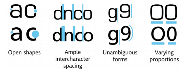
Called Burlingame, it is based on a 2012 study run by Monotype in partnership with MIT's AgeLab. The research focused on how typefaces may influence driving ability, navigation and more, and whether or not fonts could make them drive safer.
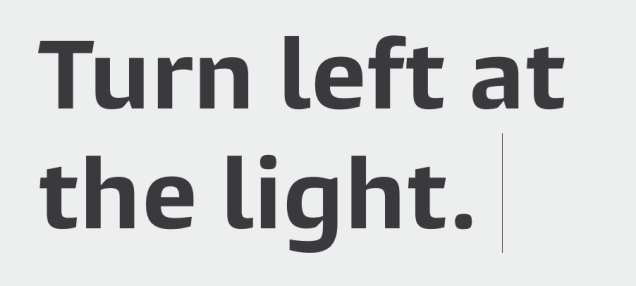
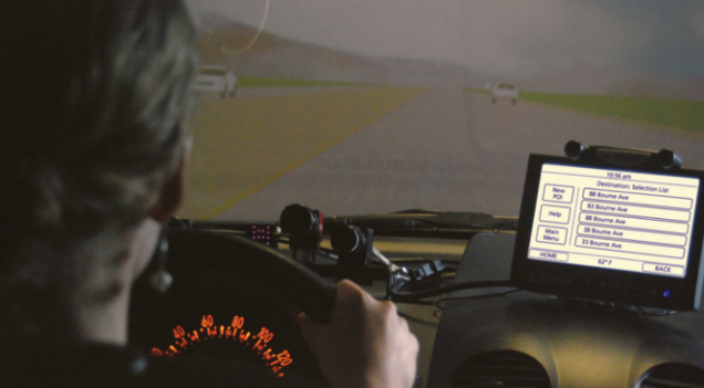
MIT asked subjects to use a GPS system and mounted it to the dashboard of a driving simulator. The directions on the GPS screen were shown in two typefaces. The first, a "square grotesque" one.

The second, is more "humanist" typeface.

Researchers tested how often the subjects looked at the screen and how often they made errors while reading it.
The humanist option required more than ten percent less "glance time" than the grotesque one. Overall, drivers had a 13 percent improvement in response time with the humanist version.
Burlingame was originally designed for use in video games, but Monotype redesigned it for drivers based on MIT's findings.
Check out more on Burlingame here.
More Articles
Copyright © Fooyoh.com All rights reserved.