The Evolution of Pantone Color of the Year and How to Use it in Your Branding
2021.07.07
Description: Why brands care about the Pantone Color of the Year? Four ideas for implementing the color in your branding.
According to research, a person receives from 80% to 90% of information about the environment through a visual analyzer. Each color includes one or another association that is fixed in consciousness and may not change for decades.
Therefore, when creating a new brand or carrying out a rebranding, it’s essential to take into account several factors.
First of all, a brand needs to assess the competitive environment by the color (for example, banks usually prefer blue; fast food businesses — red). Then it’s important to check which set of associations the current colors contain (if the brand has already been created) and how relevant they are today.
In order for a corporate color to always look the same in the real world on different media, a brand should limit itself to the Pantone reference color palette, which contains 1867 colors.
In this article, you will find out how Pantone colors can be used in branding, why utilize email signature examples, and understand the meaning of Pantone Colors of the Year.
Color of the Year sets design trends for the whole next year
Throughout the year, the Pantone Institute visits fashion shows, follows street fashion on Instagram, participates in pre-premiere screenings, visits exhibitions of progressive artists, cooperates with luxury car manufacturers, studies the interior color even before the official presentations. This way, they try to understand the mood of the fashion crowd.
Color of the Year is a fixation of the spirit of the times, an expression of the mood and desires of consumers.
Ways of implementing Pantone Color of the Year in your business
Color is an essential marketing communication tool, and we can use it in many different ways. We have identified four key situations in which the correct work with shades can greatly affect the result.
● Email signature
A uniform visual identity can help a brand represent the attributes and values it stands and is known for.
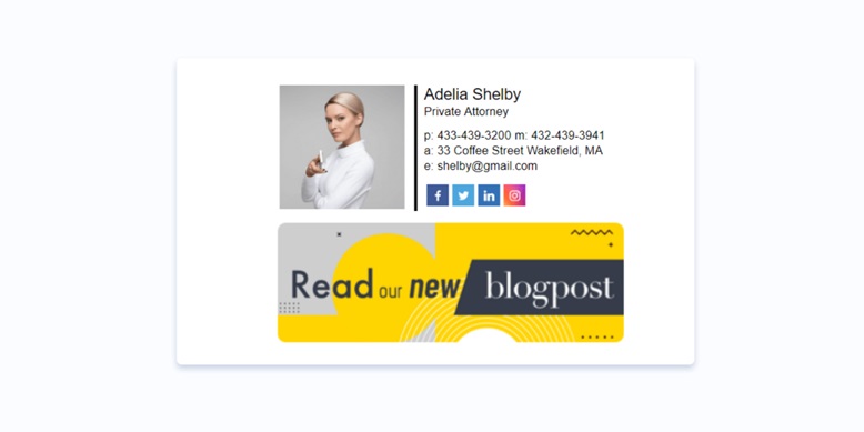
We send many emails every day. To take advantage of this potential, it is important to create a professional, visually appealing email footer using an email signature generator. In such a signature, businesses can add their contact details, promote products, services, events, sales, etc.

It is essential for the signature of every employee to remain on-brand.
In their brand books, brands consolidate the colors they use. Many have already added the paragraph for email signatures. For example, the 1-color version utilizes Pantone Classic Blue 19-4052. The 2-color version utilizes Pantone Classic Blue 19-4052 and Pantone Ultimate Gray 17-5104.
● Email template
To be consistent, the color palette in emails should match the brand’s colors. The areas in an email where colors matter include:
❏ Email background
❏ Content background
❏ Navigation bar
❏ Footer
❏ Buttons
❏ Links
❏ Text.
● Website
The color has also taken center stage in the web design trends. The visual strength and expressive power of color can both attract people and discourage prospective buyers. In 2021, the combination of vivid colors and neutral shades is one of the key color trends in web design. As a rule, such color blends can help direct the visitor’s attention to where you want it to be focused. If you aim to make your website look modern and attractive, you can also experiment with isolated notes of luminous colors that capture visitors’ sight.
● Corporate souvenirs
Brands can also give themself a unique edge by choosing promotional souvenirs in the shades their customers will instantly associate with their favorite brand.

Source: Promotion gift
Last 5 years Pantone Color of the Year
Every year, Pantone announces the Color of the Year. In 2021, these are Ultimate Gray and Illuminating. Let’s look at the history of previous years.
● 2021: Ultimate Gray 17-5104 and Illuminating 13-0649
The flagship colors of 2021 are Ultimate Gray and Illuminating. They symbolize stability, unity, and hope. According to Leatrice Eisman, executive director of the Pantone Color Institute, gray is the color of reliability, while yellow is the quintessence of hope and optimism. So Pantone wants to inspire people to see change, metaphorically and literally, as the clouds overhead are often replaced by sunlight.
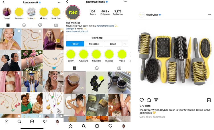
The brands in the hope of being considered cutting-edge and ahead of the curve, have already used Ultimate Gray and Illuminating (or very similar) colors in their color palettes.
You can see the examples of brands like Kendra Scott, Rae Wellness, Dry Bar below.

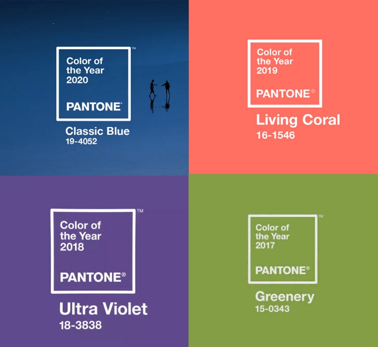
● 2020: Classic Blue 19-4052
In 2020, Pantone explained that this shade helped reduce anxiety in the world, which has become the scourge of modern society. This color was perfect for various financial companies and businesses dealing with money (banks, technology, law firms, insurance). It is associated with stability, trust, confidence, and connection.
● 2019: Living Coral 16-1546
The life-affirming coral shade with natural softness energizes and adds strength. This was a perfect color to create contrast or add a little romantic touch to your brand. Orange is also the top color associated with fun, freedom, and positivity.
● 2018: UltraViolet 18-3838
The color is all about embodying the spirit of invention and creative imagination.
When purple became the color of the year, Adobe released a tutorial on working with this shade in Photoshop, and, for example, the popular Los Angeles confectionery My B Sweet made purple cake toppings. Some branded stores tried to design windows and posters so that the leading role was given to the Color of the Year.
● 2017: Greenery 15-0343
The green color is refreshing and revitalizing. It symbolizes new beginnings and youth. The color can be paired with a variety of shades like neutrals, brights, deeper shades, pastels, and even metallics.
While green is usually associated with nature and growth, it also evokes balance and harmony. When used in marketing, it can be either logical or emotional. This color is strongly connected to marketing for industries such as finance, beauty, wellness, organic food, health.

Final words
For a corporate color to always look the same in the real world on different media, a brand should consider using the Pantone reference color palette, which contains 1867 colors.
Every year, the Pantone Color Institute announces the Color of the Year that expresses the mood and desires of consumers.
Brands that use this color are considered cutting-edge and ahead of the curve.
In this article, we discussed the ways of implementing Pantone Color of the Year in business. These include using the Pantone color on a website, in email mailings, email signatures, and more.
More Articles
Copyright © Fooyoh.com All rights reserved.