What are some Billboard Advertising examples and why do they work?
2020.09.07
Billboard advertising can be used for brand awareness, or to promote a short-term retail product to the markets and can be super effective when used correctly. An easy way to measure effectiveness is how the billboard advertisement generated salience or stuck in the mind of the audience.
Let’s look through some of the good and some of the bad examples of billboard advertising, as we take you through the objectives, what the ad means, and why it worked (or may not have)!
Follow the Arches
McDonald’s has a great variety of billboards for both brand and retail. This company is widely recognised, and it is a household name. The advertising and branding under McDonald’s is so iconic that it’s still effective in a minimalist form, even where cutting off ‘the arches’ of the Big M is still visible as part of the brand.

Source: Adweek
The objective of this campaign is to direct customers where the closest McDonald’s is from their commute, drive, or trip. These billboards were intended to solve the problem that across the planet, there are inconsistencies across in design and style, pointing customers to McDonald's. These inconsistencies can create fear for the company that there could be mistrust between the company and the customer. McDonald’s solution was to create a minimalist, and still easy to read and understand, billboard advertisement that informed customers of their location.
The billboards took a part of their iconic logo and made into directions, clearly marking out where the McDonald’s is. This was adaptable to anywhere throughout the world, both helpful and recognisable. Billboards are great for maintaining top of mind awareness and exposure, and by placing these billboards in strategic locations close to McDonald’s, it has a super high return on investment and increases traffic into the store or drive-through.
Bremer Bank

Source: Pinterest
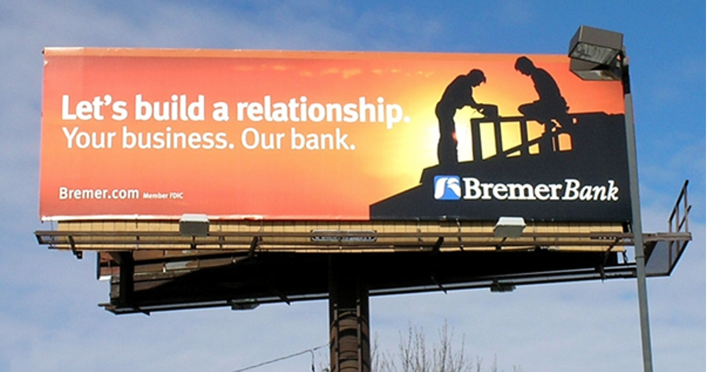
Bremer Bank cleverly used a combination of both images and copy to get across a super clear and easy to understand concept. Bremer Bank understands it can be difficult for businesses to choose the right bank for them, as it makes day to day banking go from a relatively thoughtless process to a highly involved one.
This billboard advertisement’s audience are those small-medium businesses in construction or a similar industry, displayed clearly with the two people building together. This billboard doesn’t have a clear ‘call to action’, such as Call Us Now with a phone number, because this billboard is to generate salience and exposure with these customers. By creating this awareness, Bremer Bank would ideally be at the top of someone’s mind when deciding on a bank for their business.
Zico’s 100% coconut water


Source: Dailybillboardblog
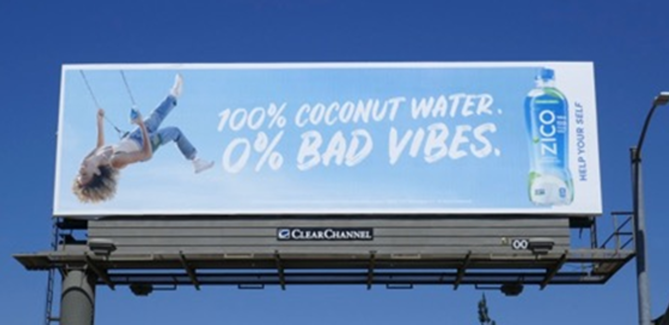
When creating a billboard advertisement, think of the ‘three-second rule’, where someone has about three seconds to read and digest your ad. The advertising objective for Zico Coconut Water is to spread awareness of their 100% coconut water and feel great! The target audience here is young women who care about what they put in their bodies.
The copy is easy to read and understand at a glance. It uses youthful language, which will grab the attention of Zico’s target customer. The overall creative concept looks bright, bold, and colourful, which is eyecatching. Zico promotes the product on the billboard, allowing audiences to recognise the product if they were in a shopping environment. There isn’t a written call to action here. But, there doesn’t need to be as the inspirational imagery communicates it effectively.
State Bank

Source: The Financial Brand
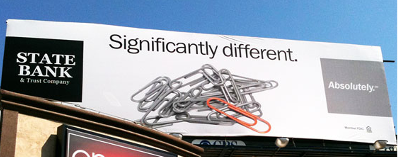
The intended message here is “Bank with us because we’re different”, but it doesn’t show how different, or why. We can see this because the paperclip is orange, but it is still a paperclip. The ‘Absolutely’ also is confusing as it’s vague and doesn’t quite explain what this tagline means.
This ad has good layout and design, as it’s not busy and is straight forward. It also has minimal copy (words) on it, which makes it direct and easy to understand at a glance. This billboard is also to build salience and encourage people to switch banks to them if that is what they were thinking of doing.
To improve on this, we would suggest removing the ‘Absolutely’ as a tagline or create sub-copy to explain what this means. We would remove the paperclips altogether, and replace it with a photoshopped image such as the below, to highlight just how significantly different. For example, the black lab surrounded by all of the sheep:

Source: Daily Mail
Billboards are best used not to get people to pick up the phone and call you, but to bring awareness to your company and tell your audience “Hi, I exist!”. Billboard advertising does a great job of generating the initial customer exposure and generate intrigue. The difference between a compelling and a poor billboard is vast, and it comes down to clarity, concise messaging, and easy to read visuals/design. Once you nail these three, you have an excellent billboard.
About Us
Lighthouse Digital is your go-to, one-stop-shop for any digital signs, digital billboard, and digital marketing solutions. Our capabilities range throughout the entire marketing funnel, from creating awareness with your target audience, to driving those sales and leads.
We can provide end-to-end digital sign solutions for any business sector so you can communicate with your target market and customers in real-time, integrated digital marketing campaigns, and out-of-home digital billboards.
More Articles
Copyright © Fooyoh.com All rights reserved.