 Facebook’s New News Feed Was Designed Using Post-Its

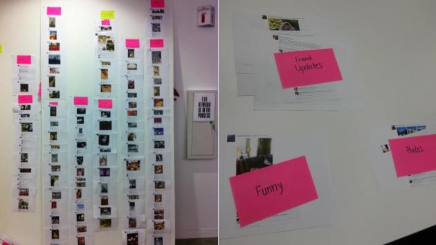
How do you design the interface for a multi billion dollar social network? Going the old school style of course. According to a blog post, it's new news feed was developed using Post-its and a large blank wall.
We came up with the idea of multiple feeds, each with its own focus on a particular topic, type of content, or type of friend. It was a good start, but crucial questions remained: which feeds to offer, and which stories to put into them?
I gave each participant a stack of recent stories from their feed, printed out on paper, and asked them to pick out the ones that interested them and discard the rest. Next, I asked them to sort the remaining, interesting stories by putting them into piles separated by what they liked about each. An analysis of participants' piles and the stories they'd put into them yielded clear themes.
And there you have it. [Facebook via Engadget]I gave each participant a stack of recent stories from their feed, printed out on paper, and asked them to pick out the ones that interested them and discard the rest. Next, I asked them to sort the remaining, interesting stories by putting them into piles separated by what they liked about each. An analysis of participants' piles and the stories they'd put into them yielded clear themes.


