 The New Facebook Looks Like The New Google+

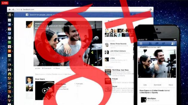
Facebook has unveiled its latest look for the news feed, but they weren't the only ones announcing a change. Google+ too.
After it was debuted, people took to Twitter to discuss the similarities between the update and the existing look of Google+.
Facebook introduced on Thursday more white space to make reading easier on the eyes, and it's shift sort of looks like it reflects Google+'s signature look.

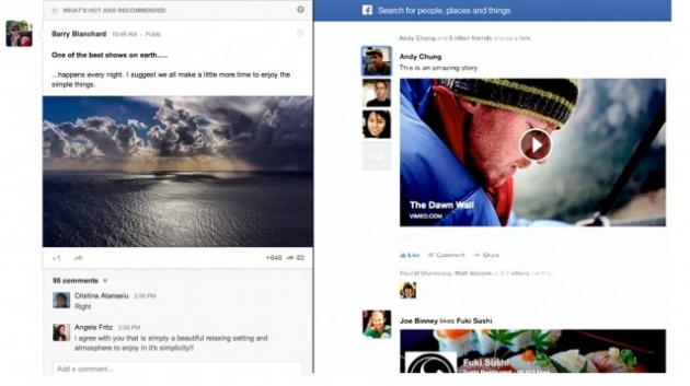
The similarities, side by side are obvious. Facebook's new look takes updates from friends called Stories, from small thumbnails to blown up displays, like Google+'s approach to highlighting updates.
Facebook will be removing its left side bar and replacing it with a cleaner, sleeker black bar with visual icons for bookmarks like messages and chat, looking more like Google+'s existing grey scale side bar that's stacked with icons.
What do you think? Do you like the new Facebook?


